There is way too much clicking needed to switch between any task you’re trying to do.
If you had Live / Recordings / OtherName, the main purpose of the Tablo would be easily at your fingertips. Even if “OtherName” was kept as Home, all the extra things (Shows, Movies, Sports, For You, Your Favorites, Upcoming…) would fit perfectly in this section. Even leaving that as the default page wouldn’t seem so bad, since it would be a click or two from what we use most, including the settings.
Maybe I wouldn’t have to hit the refresh/reload button nearly every time I need to use the settings if the app wasn’t trying to load something for each of the 6 clicks it takes to get there from Library. But right now, that’s the only way to switch Tablos. (And on that note, a nice little identifier of which one you’re connected to would be great – the mobile app is very clear on this, and even easier to switch between.)
You seem to be confused. Tablo’s objective isn’t to provide an app that is efficient and that accomplishes the desire affect with the minimum of effort. It is to splash the screen with what some think are pretty pictures.
Maybe because others seem to be doing that. The legacy firetv app is a prime example. It takes 11+ clicks just to disconnect so you can switch to another tablo. And since the app seems to like to startup in the menu you were last in, it starts in the settings menu.
I think the app returning to the same place you left off at (including a recording in progress) can often be helpful. But, the whole “switch Tablos” routine is a nightmare. Hopefully, they are able to implement some of these UI changes into upcoming versions.
I know it’s asking a lot since there are so many other things needing work in these 4th gens, but, maybe eventually…
Some households dedicate a tablo unit to a specific type of recording or to a sepcific goups of users how do you make the switch work better for all types of users?
I’m having a hard time trying to figure out what you’re asking.
I would think that any quick setting to switch Tablos would work in both scenarios. Anything that brings your 11+ clicks down to 3 or 4 I’m sure would be an improvement.
“Groups of users” could easily be done by separating networks. “Type of recording”… that’s where the device name comes into play. It really feels like I’m misunderstanding what you’re trying to say or ask, sorry.
You and I have made clear in other topics that the ability to switch easily as well as know which device you’re on could be a huge benefit.
I didn’t mean to get us started down this road again, sorry! I think that the switch option could be implemented pretty much anywhere – even if it had its own tab. IDK… I have no UI creation experience. What are you thinking would make it work better for you?
The legacy roku app takes 3 clicks from the main menu. And one of the clicks is effectively a disconnect which I don’t think exists on the gen 4 app. So if all you want to do is disconnect the app from any specific tablo unit it’s 2 clicks.
That sounds perfect. I think that was something we’d thought about in the other topic: Current connected devices. And no, the 4th gen app does not have a disconnect button, but in the Android/Fire version, if you go to Switch Tablo > Yes, Switch Tablo. By hitting the Back button again, you’ll be asked if you want to Exit. When “Yes” is chosen, that same “Multiple Tablo Devices Found” screen will appear at the app’s next launch.
Even your little tweak would pass for something – although I still prefer if it had a “switch Tablo” button as well, or as a popup before giving the confirmation to disconnect entirely. I really wouldn’t mind disconnecting from my Tablo after most uses, since just hitting “Home” on the remote defaults to your last device used. If this was the only way to disconnect, though, it would get old really fast. Users with only one device would never use these buttons, and so it could be put at the bottom.
As it is now:
“Yes, exit Tablo”
“No”
“Disconnect” or “Switch” right below that would make this a simple process by just hitting the Back button a couple of times.
Don’t have multiple Tablos, so can’t comment on switching devices. But I do strongly dislike the Home screen, and for me, it’s always going to be a speed bump on the way to the Live or Library tabs (and occasionally to Shows/Movies/Sports).
I access the Tablo app on Android TV, so I already have a home screen that tries to recommend me stuff and waste my time. I don’t need to open the app from one homepage to another homepage. It’s homepages all the way down. Homepageception.
I did read that in the legacy app, you can choose what tab to start on? If that’s the case, then hopefully the option will come soon to the 4th gen.
I am not saying it is perfect, but I much prefer the new UI over the old one which I thought very clunky and sluggish. They are not appealing to the hardcore users, this is more to attract the mom and pops with the big flash icons and full screen images and graphics.
Pretty much known, the HDHR with Plex or Channels is a much better power user experience and can do a lot more.
It’s great you like the new home screen. Just let me startup the app and default to the Recordings menu or Live menu, or Scheduled menu. I really don’t need and not impressed by prettey pictures. I just want to quickly access the important information.
And along the way fix the Recorded episode detail record to show the original scheduled time, the actual recorded time, and how much is left to watch.
What do you mean by that? Are you saying you’re recording shows outside their scheduled time and it’s giving conflicting data?
As for how much is left, I don’t think the Roku apps show it, but there is a bar at the bottom of the icon for some versions that is showing approximately how much you’ve watched. Also, if you’re watching a recording, the Android/Fire version can give an information overlay with how far you’re in as well as how much is left (you can bring that up when you’re FastForwarding/Rewinding, or with an Up or Down button on the remote). Part of the inconsistency between apps that I’ve noticed.
Witth the legacy Roku and firetv app in the recording detail record(which actually doesn’t exist on the gen 4) you see the date of the recording, the original scheduled recording time, and the actual recorded time. And if any of the recording has been played you see the amount of time viewed and the amount of time left to be viewed.
Do you see that in a gen 4 recordings detail record?
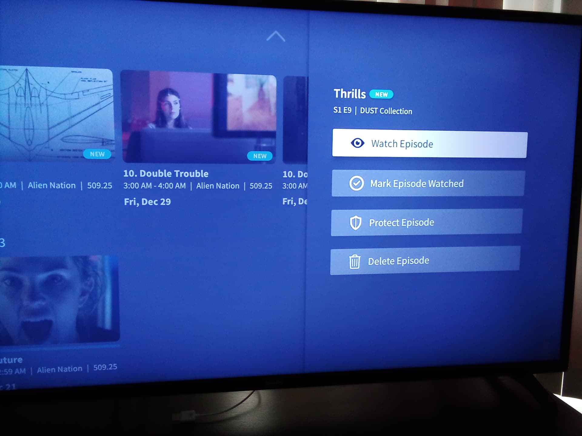
It isn’t totally clear in the last one, but to the left is how much has played, to the right is how much is left. If you click on Info, that’s the ONLY way to get the EPG data, etc.
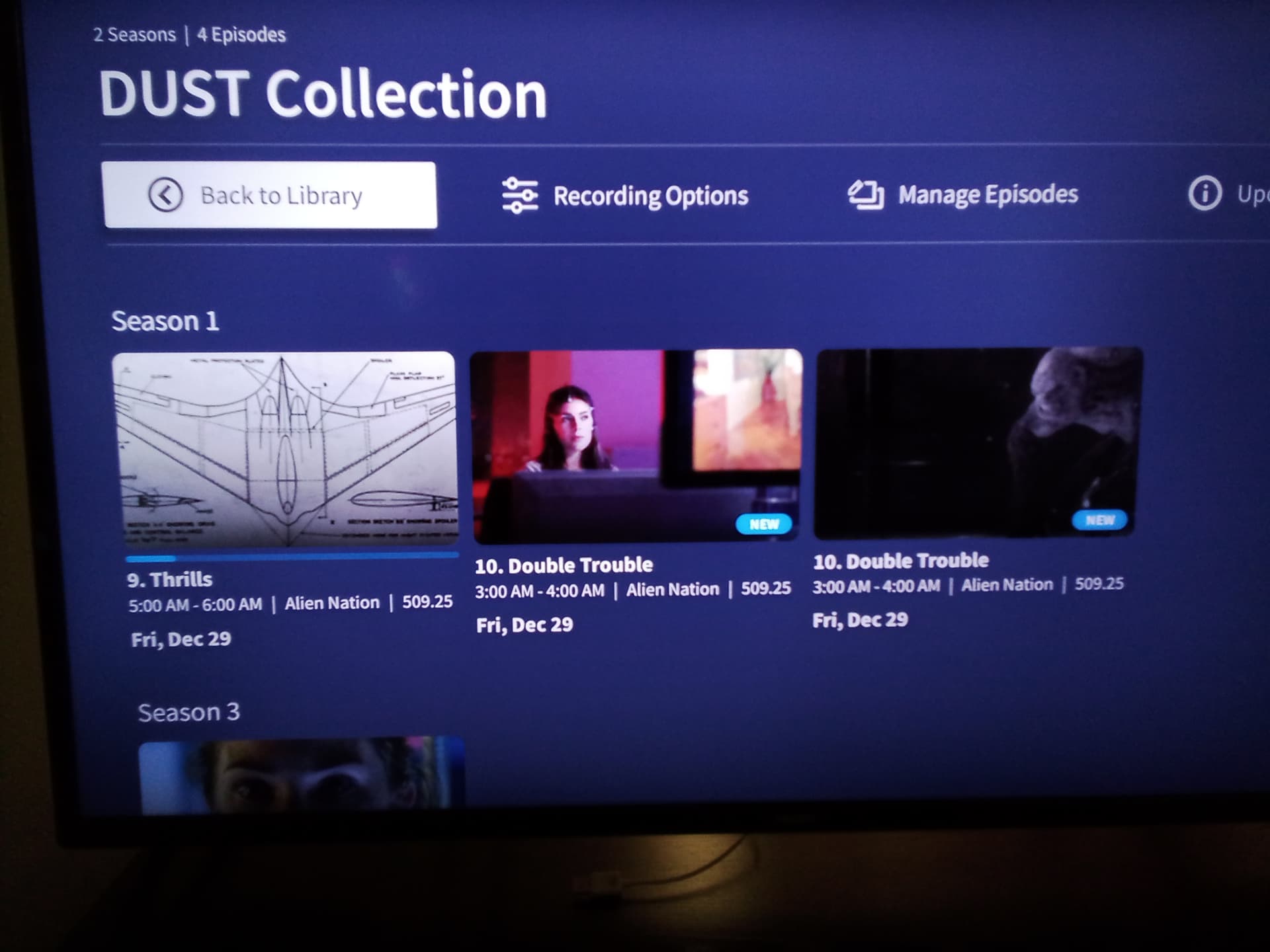
And since they all say 509.25 is there something special about 509.25? And it appears you have a segmented recording for episode 10. Can the start and end time for both be 3AM to 4 AM. How do I know if both segments record time adds up to 1 hour?
And if you have to actually play the record to see the total time and the legacy doesn’t is there some information missing from the gen 4. Of course how does the scheduled time account for the extend live option record time. I know I have to play the recording.
509.25 is a FAST channel, and those were all recordings from that channel. They were supposed to be “Dust Collection” on Alien Nation, but 95% of the time the guide data is wrong, so it’s a station I frequently record trying to get the correct shows, as well as testing.
I hadn’t noticed the split yet, good eye. That one falls into the “Who knows if it’ll record” time slot of 2-6am. SMH
You’re right about all those questions. There is NO simple way to see how long the splits are unless you’ve played them, and you have to manually add the time up yourself. Sometimes they’re close, sometimes you’re missing 15+ minutes.
I haven’t done an automatic live time extension (not a sports fan), nor have I recorded outside the specified times. I will set something up for later today and post it.
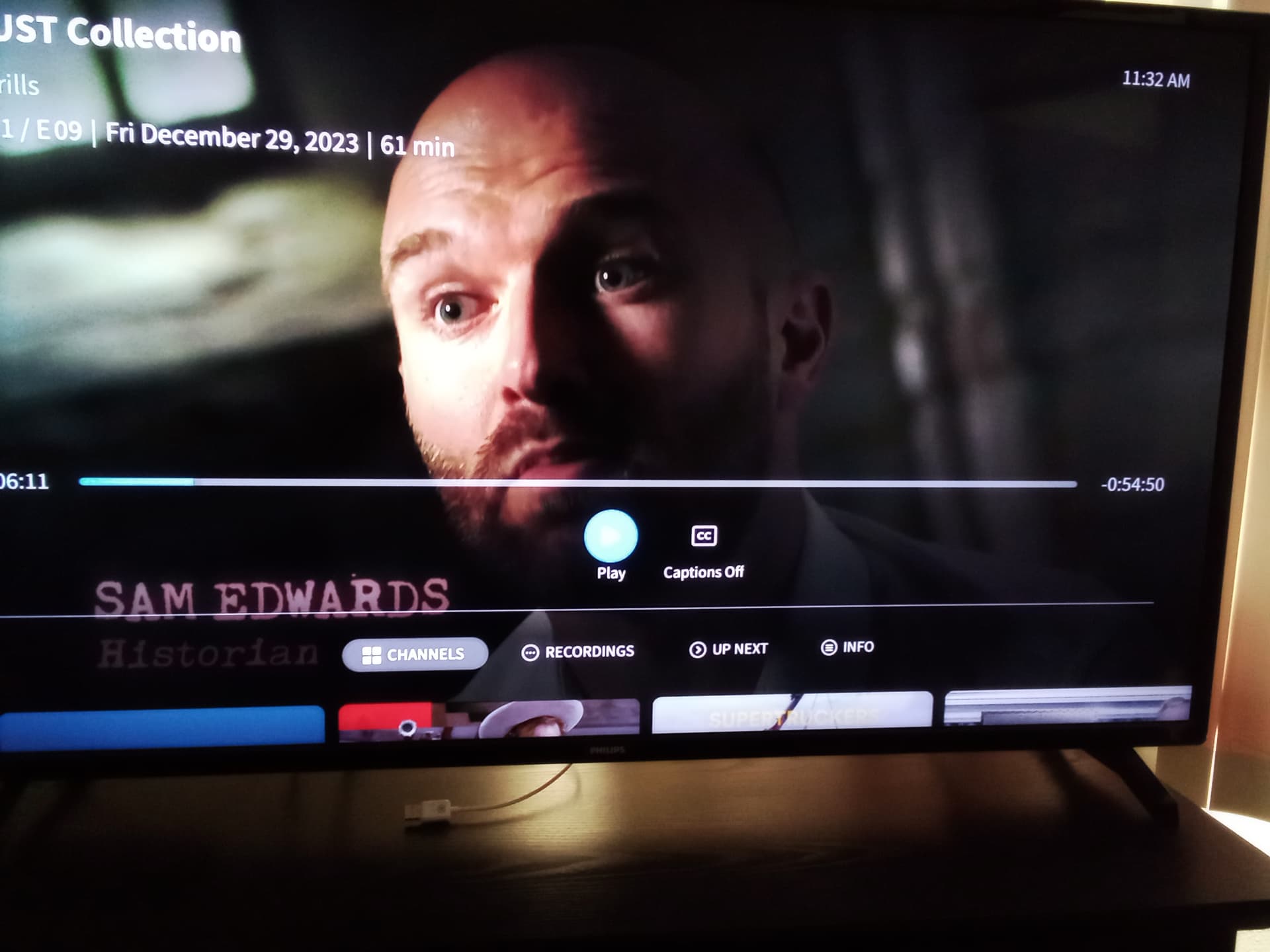
Woah. Browser view. (A web applet would take care of so many of these messed up app issues!)
Is this the same type of thing that you see when on your Roku?
That popup is very informative and something I’ve already suggest way way way back in the early days when I first joined (wow, it feels like years ago, has it really only been a couple of months?)
It feels like they’ve written the new code entirely from scratch. Maybe having something to do with that lovely MPEG-2 encoding? Seeing how the Legacy shows up (and I’m still jealous of the Legacy web viewing ability), it seems like there’s a lot missing from these 4th gens. “Work in progress,” I’m sure.
I’ve asked before (but have not received an answer) about using the web player. Are you able to change the speed of video playback in any browser at all?
There are shows other then sports that are live. SNL, Oscars, Golden Globes, etc. Of course the gen 4 max extend of 30 minutes really cover many “live” shows. Maybe in canada it does.
I thought that the extended was 150% of the recording time?
I do have “Extend Live Recordings” ON… and SNL has never been extended. Maybe it’s only listed as “New” in the EPG for some reason? (No new episodes coming up for a while, I’ll have to check in 3 Saturdays ore more!) Even looking an upcoming college football game, nowhere does it list “Live”. Gonna record it and see what happens in about 6 hours! (BTW, the Sports section is pretty pointless by defaulting to “Live Now.” Either nothing’s on, or you’ve already missed the beginning! Instead, it looks like they focused more on that Home Screen and the “Live and upcoming sports” scroll is much more functional…)
On the west coast you get the joy of the same SNL brodcast twice on the same night. The earlier one is marked as New and Live. You have to check the Golden Globes on CBS to see it is marked as New and Live.
Tonights Tiger Bowl NCAA football game on CBS is Live. As are tomorrows 2 Football games on ABC and CW.