Whoever’s idea it was to place this live now button on the top clearly doesn’t record many programs. It’s dumb to have to constantly click down now to have to record a show. Recording should be first option over watching the channel live!
Well I like having the watch live at top left, “makes more sense” to me but if they changed it I’d be OK with that too ![]()
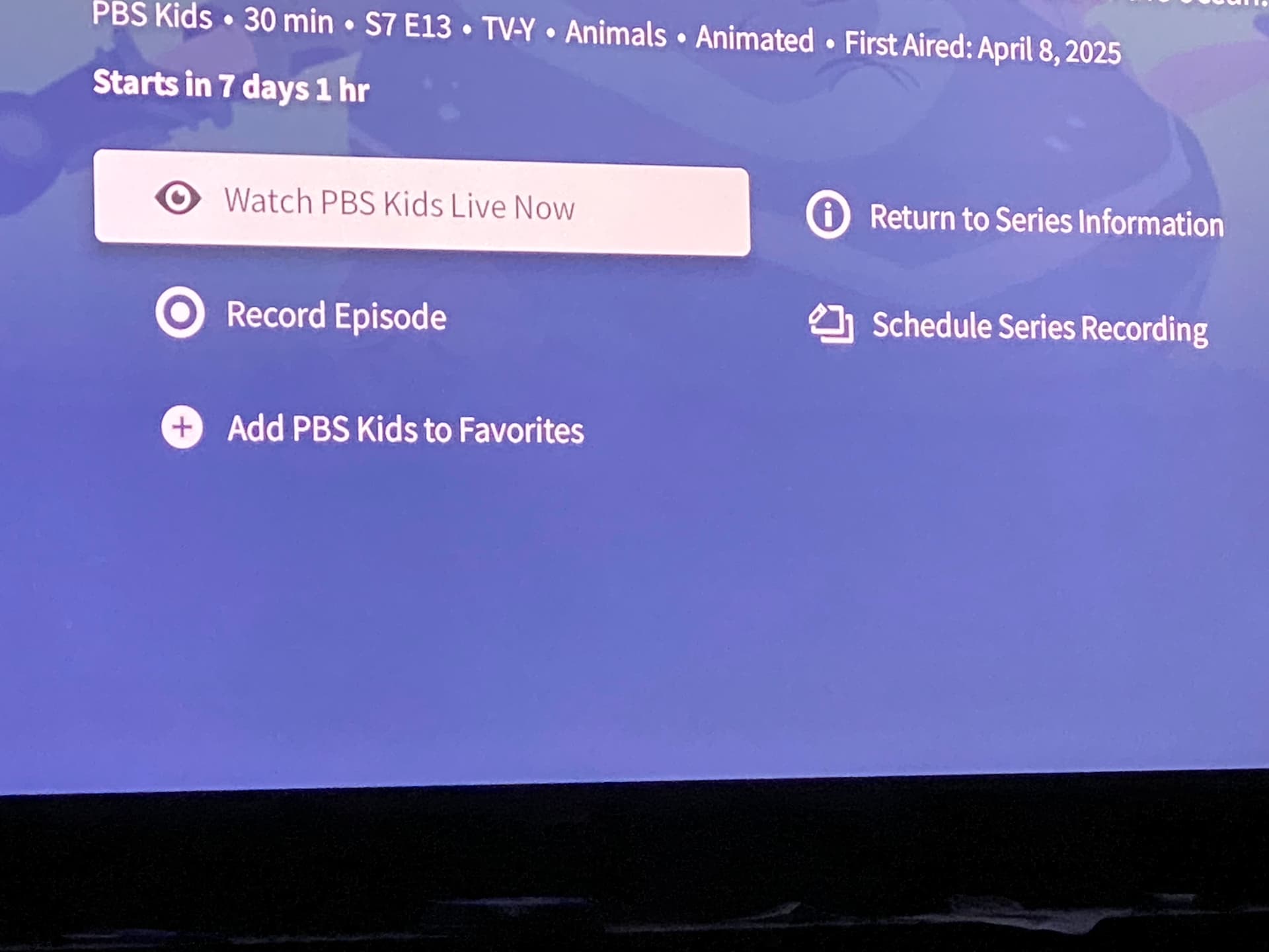
Is there any live tv service where “record episode” is the first option? I don’t think I’ve ever seen that and I certainly have never missed it.
I also think it’s a different view according to which platform you are using.
Do you think an episode that is 7 days 1 hour in the future is a “live” TV service. Try SlingTV. Any show/episode that is currently in the future has a record option and no watch option
1 Like
Human Factors, also known as human factors and ergonomics, is the scientific discipline that studies how humans interact with their environment and systems. It focuses on understanding human capabilities and limitations to optimize human well-being and overall system performance, particularly in design. This involves considering physical, cognitive, and organizational factors to create safer, more efficient, and more comfortable designs for products, tasks, and workplaces.
This UI/UX is twisted into somebody’s organizational structure that makes little sense to me, but we manage.
1 Like
@Faketurd - I wonder what happens when you click that button. Nothing? Error?
You assume the programming is being designed and coded by humans and not AI. Even Microsoft claims that 30% of it’s code is being done by AI.
1 Like
You could be on a show that airs a week in the future and that button will automatically start playing the live tv. The button works as it should, but the placement is questionable. If you’re accessing a show’s information in the future, you’re probably not doing so to watch the channel live right now.
How does a user know what they are playing(watch live). Could there be something playing “Live” on a different channel that is much better. Maybe it’s designed for users who don’t care.
Oh, I see now. PBS Kids is a channel, not a program. Ya, when I search for a program that airs on PBS Kids (or any channel) in the future, I see what you mean. Ya, maybe a little klugey and I see your point. Would your suggestion be an improvement? Maybe.
I wonder if Tablo is collecting data on how the interface is being utilized, which buttons are used most/least.
I use a Roku and at first, I couldn’t figure out what you were talking about, then I checked my Chromecast and Onn and finally saw it.
Yes, that is annoying. The Roku interface doesn’t have this button.
1 Like
Hello,
For shows set in the future, the Record button should be above Watch. The reason why Watch shows up for future shows at all is for cases where a customer clicks on a show a few minutes early, it gives them the option to click when it becomes live.
That Watch appears above Record, for future shows, is a known issue and will be corrected.
2 Likes
So when I click on the “watch” button 7 days early what do I get? Other OTT products don’t expose this button until it’s within a few(1-5 minutes) of the start of the episode.