Please rename the “Go to show” button to something more accurate, like “more info”. That label is essentially a synonym for “watch” and confusing.
What “Go to show” button in which menu and which app are you talking about.
On roku if you are in the grid and click on a TV show in the grid, the “Go to show” button" takes me to the shows listing that is in the “TV Shows” menu. This lists all the upcoming episodes for the show.
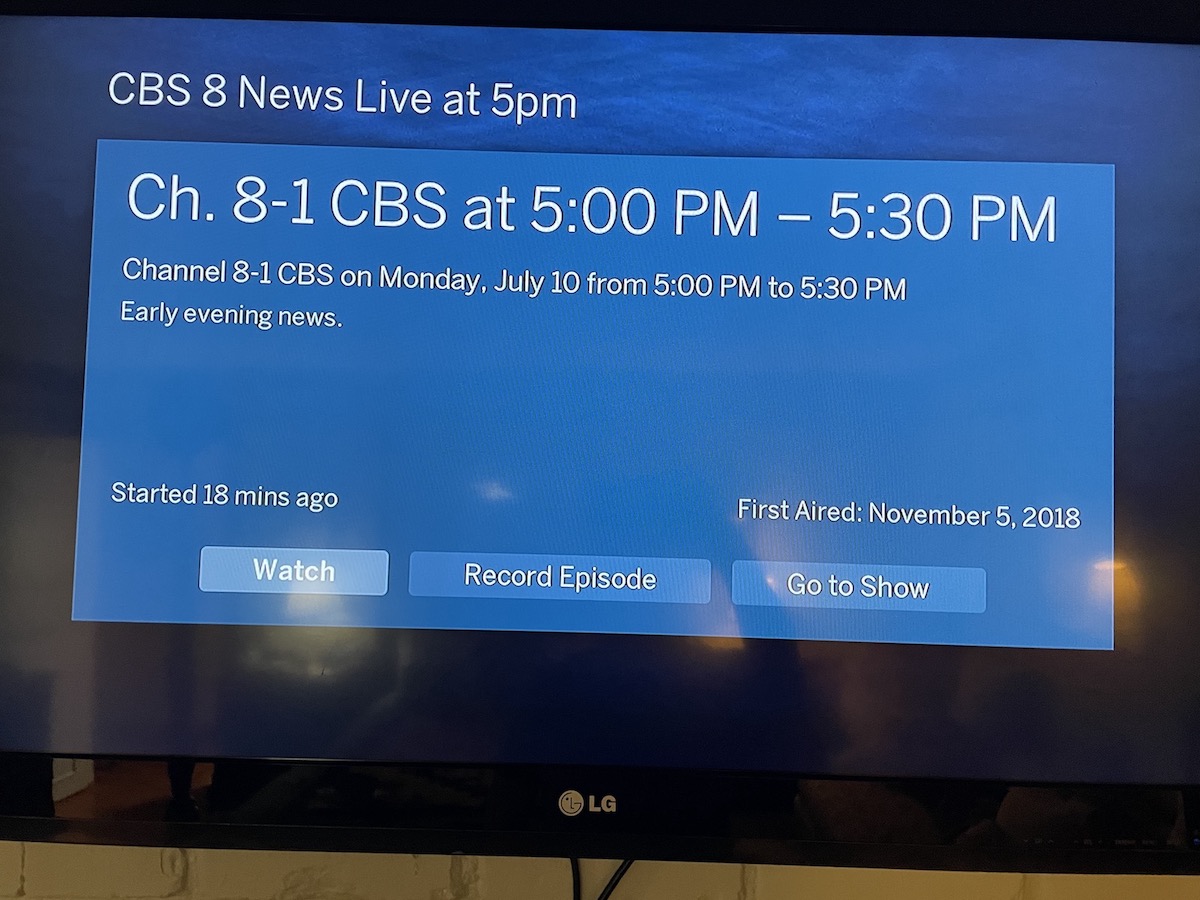
@zippy - thanks for the response. I should have been more specific, I guess: I didn’t know there is a “Go to show” button on more than 1 location. The one I’m referring to is part of the screen that shows up when I click “OK” on a program from the TV guide screen: see screenshot. 95% of the time, I just want to watch that program right now. I’m guessing/assuming that this is true for most other users, as well (but please let me know!), so adding another screen into that flow is a UI/UX misstep, IMO. But that’s another topic…
Generally, the most common workflow should require the fewest steps.
AFAIK, a “show” is something that has seasons and seasons have episodes. So, for TV, “Go to Show”, would be in reference to “the show” that holds seasons and episodes.
Outside of something that has seasons/episodes (TV), doesn’t make sense.
In that case, hit the PLAY button vs. the OK button:
That’s perfect! Didn’t know that trick–thank you!!