It’s great that on the Android/Fire versions of the app you can bring up this feed by pressing the down arrow and scrolling to pick something else:
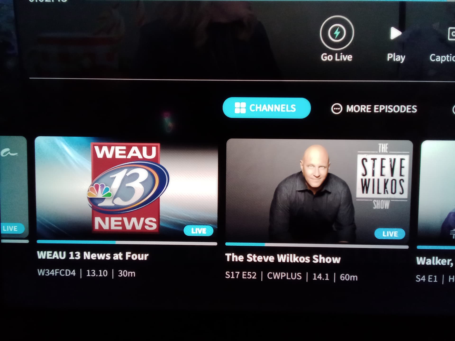
What I find very confusing is the order in which the information is presented. The stations are in numerical order, but it’s very difficult to see which station you need as you scroll.
The information below the channel seems out of order. I would think a more helpful way of representing this is:
Bold-style line 1: (Title is fine, good place to grab your attention.)
Regular-style lin2: Station Number | Station Name | Season/Episode | Total Time
Scrolling through that section would be a little easier to do if the station number was more prominent. As it stands right now, that information is nearly hidden within the text that surrounds it, and because of this, quickly going from 8.1 to 31.3 is not possible.