Hi Tablo.
Gen 4’s UI left behind some really good features of the original UI which should be easy to do (you had them 12+ years ago) and would drastically improve the user experience.
- Please bring back the icon for “unwatched episodes” or “new episodes” that used to show up in the top corner of the show’s image. Having just the text underneath the show’s image with the # if new episodes is a bad UI experience. For one thing, on smaller TV’s it’s extremely difficult to see. And for another, without the icon, it’s difficult to quickly see which shows have unwatched recordings.
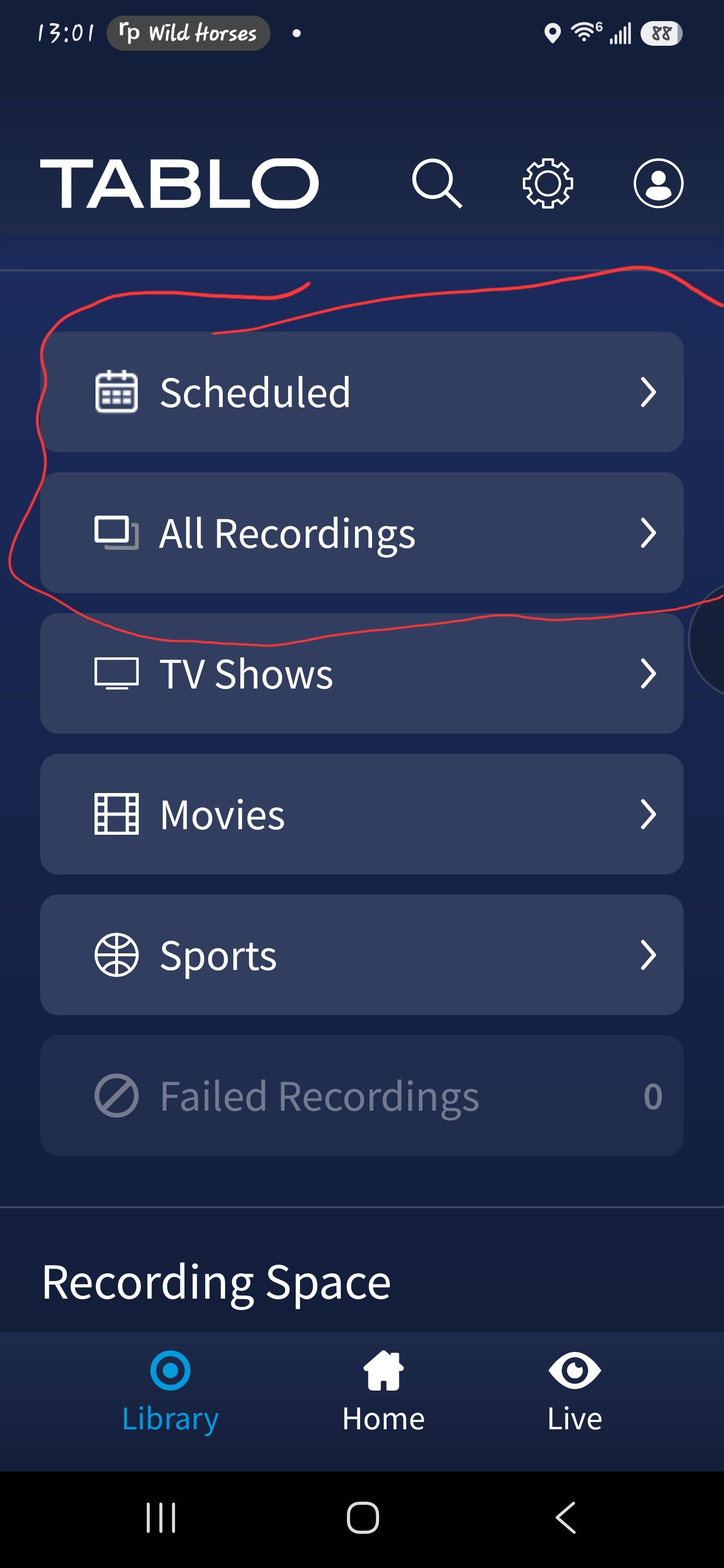
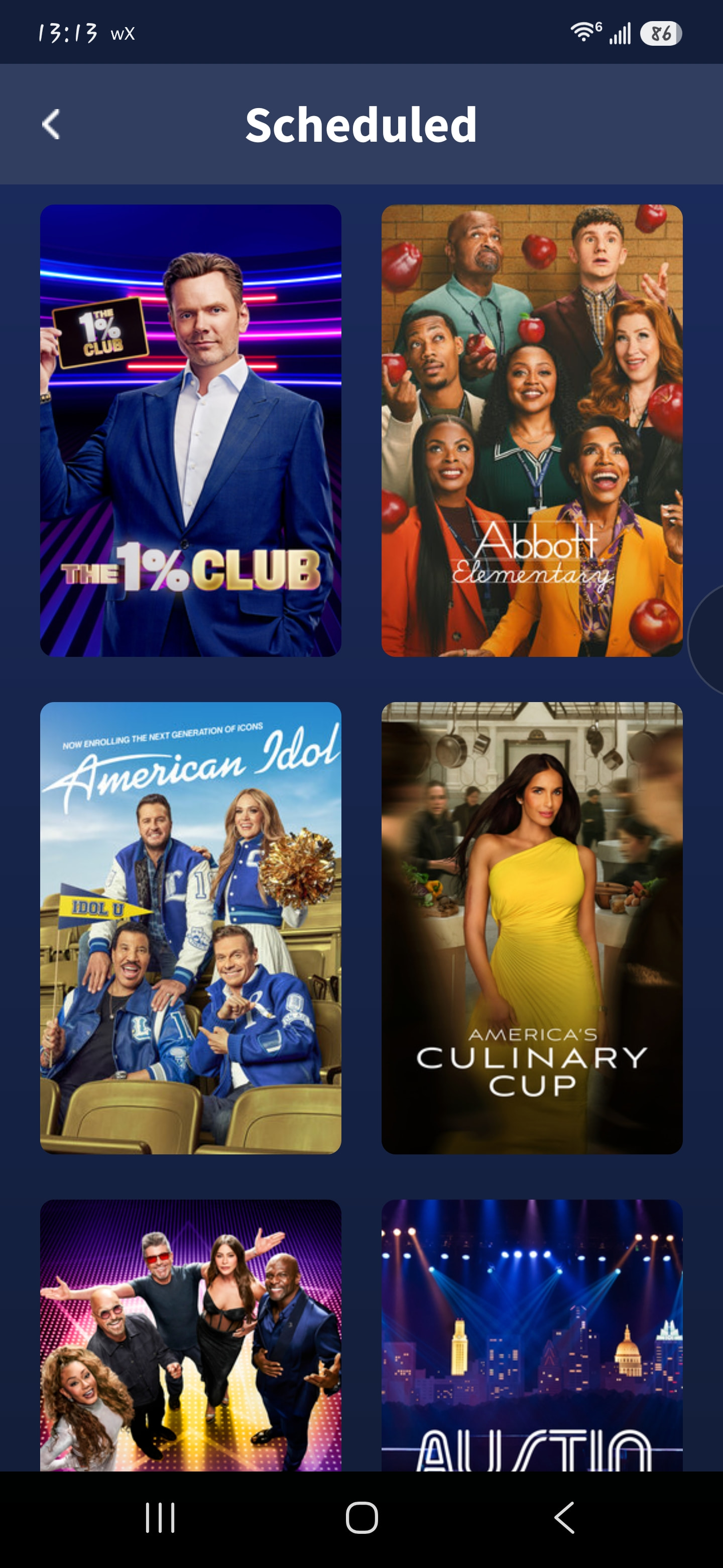
- Please separate again the “recordings” view and the “scheduled” to record view. The 1st generation UI had a “recordings” view and only shows which had actual recordings showed up on this view. This was really nice because I knew everything there was something I could watch. The 1st generation UI then also had a “scheduled” view which showed everything I had scheduled. Please bring back the separation of these two views. Having just one “all” view that only shows everything scheduled is a horrible UI experience because for every one of the shows I have to look at the tiny numbers underneath to see if there are recording to watch or not. separating these is really, really important because it’s typical for a show to not have any new episodes for a long time, maybe even years, before it comes back. It’s super annoying having to see it in the “all” view all the time.
- Please bring back the “upcoming” view. This was an awesome feature of the old UI where it quick and easy to see what show had new episodes coming up soon. This was essential for discovering new shows to watch. In the “live” view you can see the little “new” icon but that doesn’t cut it because you need scroll looking for them and it’s a pain.